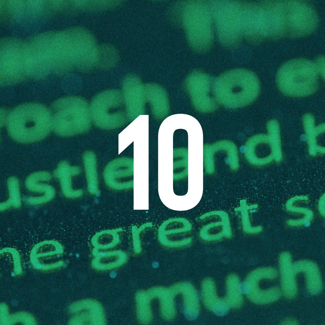
Top 10 Font Combinations - 2019
A simple tweak in the font you are using can change your brand from its current and outdated appearance to something new, refreshing and even captivating.

Few people think about the important role played by font in defining the image of their brand. Yet, a simple tweak in the font you are using can change your brand from its current and outdated appearance to something new, refreshing and even captivating.
Indeed, one of the main recommendations that brand strategists offer to companies thinking about rebranding, is to change the font on their logo and keep up with the trends.
Getting this perfect combination may seem like the most daunting task, especially when you have other important aspects of your project to worry about, but with the right font combination tools, you will get useful suggestions on the ideal font for your brand.
Note that you can download all the fonts discussed here on Google Fonts.
- Playfair Display with Source Sans Pro
- Merriweather with Oswald
- Montserrat with Merriweather
- Raleway with Lato
- Elsie with Roboto
- Dancing Script with Josefin Sans
- Abril Fatface with Roboto
- Corben with Nobile
- Alegreya with Open Sans
- Work Sans with Roboto

This is the creative tool created by Bold Web Design, an Adelaide, South Australian based company.
1. Playfair Display with Source Sans Pro
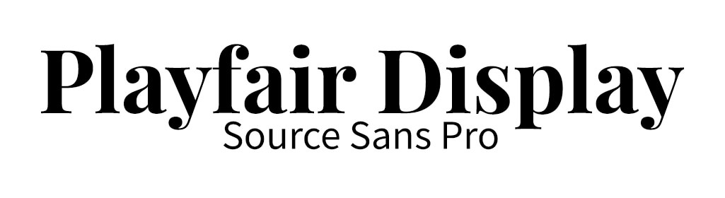
Some fonts come by as a result of transitional periods in history, and Playfair is one of those transitional designs. As the writing tools shifted from broad nib quills to steel pens, and printing technology started developing, letterforms with high contrast and delicate hairlines became popular. The font, which was developed by Clau Eggers Sorense, is traditional and elegant, and is perfect for modern day businesses. When it is paired with Sans Pro- a sans serif font, the result is a little magical on your brand.
2. Merriweather with Oswald
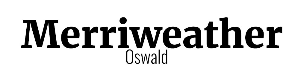
The text was specifically designed as a pleasant font which would be easy to read on-screen. The x height is large on this font, the letter forms are condensed and the serifs are sturdy. The thin and gentle lines of sans serif make a perfect combination to Merriweather as they balance its thick and bold lines.
3. Montserrat with Merriweather
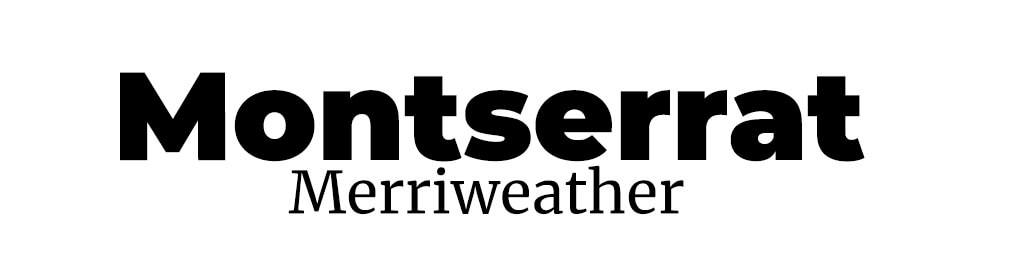
Did you know that this font is named after Montserrat, one of the oldest Neighborhoods in Buenos Aires? Julieta, the graphic designer who developed the font, is currently developing variants of the font, including the addition of italics, new weights and styles. Most big brands like carrying this font because of its legibility and easy adjustment of height and width. Pairing it with Merriweather makes the perfect combination.
4. Raleway with Lato

Raleway was originally designed by Matt McInerney as a single and thin weight font. Pablo Impallari, Rodrigo Fuenzardina and Ikerned Igino later expanded it to a 9 weight family. The font communicates a modern and streamlined style which when paired with the thin Lato, looks amazing.
5. Elsie with Roboto

A simple look at Elsie tells you how much feminine energy has influenced it. If your brand is connected to women, fashion and glamour, this is your font. The blend of Bodoni strength and Italic softness creates an attractive yet bold feminine font that is full of character and modern. Alejandro Inler is the brains behind this font, helped by Ana SanFelippo.
Elsie pairs perfectly with Roboto because of the perfect balance created between Elsie’s boldness and Roboto’s thin lines.
6. Dancing Script with Josefin Sans
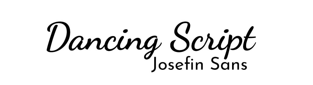
Dancing script is borrowed from some of the most popular scripts typefaces seven decades ago. This creative font gives you the feeling of freedom as it flows with each letter written down. If your brand wants to communicate an informal and spontaneous look, this is the ideal font to go for. The straight lines in Josefin Sans, balance out the waviness in Dancing Script, making the two a perfect pair
7. Abril Fatface with Roboto

The most interesting thing about Abril Fatface is how it combines neutrality and a strong presence which almost jumps out of the page. The font, which is a revamp of classic Didone styles balances color, contrast and curves attract the attention of the reader to the page. The font gets its inspiration from those used in advertising posters in 19th Century Britain and France. Veronika Burian and Jose Scaglione designed Abril. It pairs perfectly with the simplicity and softness of Roboto.
8. Corben with Nobile
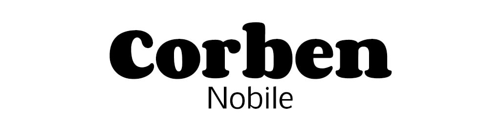
The font was created by Vernon Adams, an MA in Typeface design expert from California. The text has a rounded serif and comes in a number of weights. Its combination with Nobile, a Sans Serif font, makes a perfect pairing for your brand.
9. Alegreya with Open Sans

A very traditional style font, Alegreya is eye catching and timeless. It is the type of font that could be used for a very modern brand or seen in an antique book. With it’s bold style, if needs to be paired with a very subtle font like open sans.
10. Work Sans with Roboto

Bold, with straight lines, Work sans can work just about anywhere. Due to its versatile personality, if could be paired with a similar font, like Roboto, or something more traditional.
Author Bio.
Debbie Morgan is a passionate UI Designer for Bold Web Design, an Adelaide, South Australian Based company. She loves everything to do with fonts and web design.